Heat maps reveal what truly engages your readers. They show where eyes linger, clicks happen, and scrolling stops. This guide breaks down heat map creation and analysis for websites.
You’ll learn to set up eye-tracking, implement click analysis, and visualize scroll depth. We’ll also cover advanced techniques to maximize insights and avoid common pitfalls.
By the end, you’ll have the tools to boost reader engagement through data-driven design decisions. Or, you can listen to the discussion of this blog on our podcast “Content Conversations“:
You can also just click here for immediate access:
Step 1: Set Up Eye-Tracking Heat Maps for Your Website
TL;DR:
- Choose a reliable heat map tool
- Install tracking code on your website
- Define Areas of Interest (AOIs) for focused analysis
- Configure eye-tracking settings for accurate data collection
Choose the Right Heat Map Tool
Selecting the right heat map tool is crucial for gathering accurate user behavior data. Here are four popular options to consider:
- Hotjar: A comprehensive tool that offers heat maps, session recordings, and survey features. It’s known for its user-friendly interface and easy setup process.
- Crazy Egg: Provides detailed heat maps, scroll maps, and A/B testing capabilities. It’s particularly useful for e-commerce sites due to its confetti reports feature.
- Lucky Orange: Combines heat maps with real-time analytics and visitor recordings. It’s praised for its intuitive dashboard and affordable pricing.
- MouseFlow: Offers advanced heat mapping features, including live heat maps and form analytics. It’s suitable for businesses looking for in-depth user behavior analysis.
Each tool has its strengths, so consider your specific needs, budget, and technical requirements when making a choice.
Best Heat Map Tools Compared
| Tool | Features | Best For | Pricing |
|---|---|---|---|
| Hotjar | Heat maps, session recordings, survey features, user-friendly interface, easy setup | General website analysis, beginners, small to medium businesses | Free plan available, paid plans from $39/month |
| Crazy Egg | Heat maps, scroll maps, A/B testing, confetti reports for detailed analysis | E-commerce sites, detailed click analysis, A/B testing | Paid plans from $24/month |
| Lucky Orange | Heat maps, real-time analytics, visitor recordings, intuitive dashboard, affordable pricing | Small businesses, budget-conscious users, real-time insights | Paid plans from $14/month |
| MouseFlow | Live heat maps, form analytics, in-depth user behavior analysis | Advanced user behavior analysis, form optimization | Paid plans from $24/month |
Which heat map tool is best?
The “best” heat map tool really depends on your specific needs, but here’s my breakdown to help you decide:
Hotjar:
Strength: It’s good for general mobile insights and offers session recordings that can be segmented by device type.
Mobile Support: Hotjar offers mobile-responsive heat maps and allows you to track user behavior across mobile devices.
Limitation: Lacks advanced mobile-specific features like deep mobile app integration.
Best for: Beginners, small to medium businesses, and general website analysis. Small to medium websites needing an easy, mobile-friendly solution.
Why choose: Hotjar is widely used due to its user-friendly interface, ease of setup, and comprehensive features like heat maps, session recordings, and surveys. It’s great for understanding user behavior across a broad range of websites, and it’s ideal if you’re just starting out or need a tool that’s easy to use.
Crazy Egg:
Strength: Its confetti reports and A/B testing features are especially useful for optimizing mobile landing pages and e-commerce product pages.
Mobile Support: Crazy Egg works well on mobile, offering mobile-responsive heat maps and detailed click tracking.
Limitation: Does not offer as advanced mobile tracking as some competitors, particularly for mobile apps.
Best for: E-commerce sites looking to optimize mobile conversions with detailed click analysis, and A/B testing.
Why choose: Crazy Egg offers advanced features like A/B testing and confetti reports that break down click behavior in detail. It’s particularly useful for optimizing conversion on product and sales pages. If you need a tool for visualizing detailed interaction, it’s a strong choice.
Lucky Orange:
Strength: It provides real-time insights into mobile user behavior, making it great for adjusting mobile designs on the fly.
Mobile Support: Lucky Orange supports mobile heat maps and real-time mobile session recordings.
Limitation: The mobile interface could be more intuitive compared to competitors.
Best for: Small businesses or budget-conscious users needing a mobile-friendly heat map solution at an affordable price and looking for real-time insights.
Why choose: Lucky Orange provides heat maps alongside visitor recordings and real-time analytics at a lower price point. It’s great if you’re on a budget but still want powerful analytics, including form tracking and conversion funnels.
MouseFlow:
Strength: Its in-depth mobile tracking features, including detailed form analytics and user behavior tracking, make it suitable for mobile-focused businesses.
Mobile Support: MouseFlow excels at segmenting data by device type, including mobile-specific analytics. It provides live heat maps and advanced mobile tracking features, including form analytics.
Limitation: Slightly more complex setup for basic users.
Best for: Businesses needing advanced mobile user behavior analysis and form tracking. Advanced user behavior analysis and form optimization.
Why choose: MouseFlow is designed for in-depth analysis, offering live heat maps and form analytics. If you need advanced features like detailed form interaction and specific behavioral insights, MouseFlow is ideal.
Our Recommendation:
- For ease of use and general analysis: Go with Hotjar.
- For conversion-focused analysis (e.g., e-commerce): Choose Crazy Egg.
- For budget-friendly, real-time analytics: Lucky Orange is a good option.
- For advanced, in-depth behavioral insights: Opt for MouseFlow.
Your choice should align with your specific goals-whether it’s improving overall site usability, optimizing e-commerce conversions, or conducting advanced behavioral tracking.
Install the Heat Map Tracking Code
Once you’ve chosen a heat map tool, the next step is to install the tracking code on your website.
Here’s a general guide:
- Log in to your chosen heat map tool’s dashboard.
- Look for a section labeled “Installation” or “Add Tracking Code.”
- Copy the provided JavaScript code snippet.
- Add this code to your website’s HTML, just before the closing </body> tag.
For WordPress users:
- Install a plugin like “Insert Headers and Footers.”
- Paste the tracking code in the plugin’s settings.
- Save changes and clear your cache.
For manual installation:
- Access your website’s source files via FTP or your hosting control panel.
- Locate the main template file (often header.php or footer.php).
- Paste the tracking code just before the closing </body> tag.
- Save the file and upload it back to your server.
Verify Installation
After installing the code:
- Wait 5-10 minutes for the tool to start collecting data.
- Visit your website and perform some actions.
- Check your heat map dashboard to confirm data is being recorded.
Define Areas of Interest (AOIs)
Areas of Interest are specific elements on your webpage that you want to analyze closely. Defining AOIs helps focus your analysis and extract more meaningful insights.
Here’s how to approach this:
- Identify key elements: List important page elements like headlines, calls-to-action (CTAs), images, and navigation menus.
- Set up AOIs in your heat map tool:
- Most tools allow you to draw boxes around specific elements.
- Label each AOI clearly (e.g., “Main CTA,” “Product Image”).
- Consider user goals: Think about what actions you want visitors to take and define AOIs around those elements.
- Include both obvious and less obvious elements: While CTAs are important, also include areas you’re unsure about to discover unexpected insights.
“Eye-tracking technology has the potential to revolutionize the way we understand user behavior and optimize website design.”
– Dr. Susan Weinschenk
This quote underscores the importance of carefully defining AOIs to fully leverage eye-tracking data for design improvements.
Configure Eye-Tracking Settings
Proper configuration of eye-tracking settings ensures you collect accurate and useful data.
Here’s how to adjust these settings:
- Set data collection duration:
- Determine how long you want to track user behavior (e.g., 2 weeks, 1 month).
- Consider seasonal variations and ensure you have a representative sample.
- Adjust sensitivity:
- Most tools allow you to set the sensitivity of eye-tracking.
- Higher sensitivity captures more subtle movements but may increase noise.
- Start with default settings and adjust based on initial results.
- Configure sampling rate:
- Decide how often the tool should capture data points.
- Higher rates provide more detailed data but may impact website performance.
- Set up filters:
- Exclude internal IP addresses to avoid skewing data.
- Consider filtering by geographic location or device type for targeted insights.
- Enable privacy features:
- Ensure you’re compliant with data protection regulations like GDPR.
- Set up data anonymization if required.
When to Use Heat Maps
Heat maps are best suited for:
- Identifying which page elements attract the most attention
- Discovering where users lose interest and leave the page
- Comparing user behavior across different devices
- Evaluating the effectiveness of page layouts and design changes
“Heat maps are a powerful tool for visualizing user behavior, but they must be used in conjunction with other analytics methods to gain a comprehensive understanding of user experience.”
– Avinash Kaushik
This insight reminds us that while heat maps are valuable, they should be part of a broader analytics strategy for a complete picture of user behavior.
By following these steps to set up eye-tracking heat maps, you’re laying the foundation for deep insights into user behavior on your website. These insights will guide your design decisions and help improve user engagement.
But, for you to get REAL value out of using heat maps on your website, you need traffic. And the best traffic is free traffic. Organic traffic. And Penfriend helps you do that by creating targeted content for specific audiences. Drive massive amounts of organic traffic by posting fresh, new content to your blog on a regular basis.
“This model allows users to experience the service before committing to a paid subscription, driving organic growth.”
How to Create Content at Scale with Penfriend: A Step-by-Step Guide
Penfriend.ai generates SEO-optimized content that ranks well in search engines and attracts more visitors to your site. To get started, follow these steps:
- Sign Up and Access Penfriend
Start by creating an account and logging into the Penfriend platform. - Input Keywords or Topic
Enter your desired keyword or topic into the platform’s search bar. Penfriend’s AI will use these inputs to align content with SEO trends. - Generate Titles and Outlines
Penfriend will offer a selection of optimized titles and create comprehensive outlines tailored to your niche. - Create the Article Sections
Each section of the article is enhanced with precision prompts to ensure relevance and depth. Penfriend automates this step based on the topic and SEO strategy. - Edit and Optimize
Review the draft for consistency, flow, and brand alignment. Penfriend also suggests statistics, quotes, or additional data to add value to the article.
6. Publish at Scale
With minimal adjustments, your content is ready to publish. Repeat the process for multiple topics to scale your content production efficiently without compromising on quality.
Penfriend’s ease of use allows you to produce content at scale, ensuring SEO-optimized, high-quality articles with minimal manual effort.
Step 2: Implement Click Tracking Analysis
- Set up click tracking to map user interactions
- Customize heat map appearance for clear data interpretation
- Enable mouse movement tracking for deeper behavior insights
If you’ve made it this far, I’m proud of you! We’re about 25% into the meaty topic of Heat Maps. If you’re considering throwing in the towel right about now, don’t! The insights are super valuable. That being said, if you’re running out of time you can bookmark this page and come back to it, and listen to it instead. It’s quicker (just under 7minutes) and gives you all the high level information.
You can also just click here for immediate audio access:
Wanna keep going? You’re hardcore, I like it! Let’s continue.
Set Up Click Tracking
Click tracking is a key feature in heat map analysis. It helps you understand where users are clicking on your website.
To set up click tracking:
- Log into your heat map tool’s dashboard.
- Navigate to the settings or configuration section.
- Look for an option labeled “Click Tracking” or “Click Maps.”
- Toggle the switch to enable click tracking.
Most heat map tools offer two types of click tracking:
- Single-page tracking: Collects data only on specific pages you choose.
- Full-site tracking: Gathers click data across your entire website.
For comprehensive insights, full-site tracking is often the better choice. However, if you’re focused on optimizing specific landing pages or product pages, single-page tracking might be more suitable.
Customize Click Heat Map Appearance
After setting up click tracking, it’s important to customize the appearance of your click heat maps. This helps in making the data easily interpretable. Here’s how to do it:
Adjust Color Schemes
- In your heat map tool’s settings, look for “Appearance” or “Visualization” options.
- Choose a color scheme that works best for your team. Common options include:
- Red-Yellow-Green: Red for high-click areas, yellow for moderate, and green for low.
- Blue-Purple-Red: Blue for low-click areas, purple for moderate, and red for high.
Set Intensity Levels
Intensity levels determine how your heat map represents click frequency:
- Find the “Intensity” or “Threshold” settings in your tool.
- Adjust the levels to match your site’s typical click patterns.
- Start with default settings, then fine-tune based on your data.
For example, you might set:
- Low intensity: 1-5 clicks
- Medium intensity: 6-20 clicks
- High intensity: 21+ clicks
Tips for Clear Data Interpretation
- Use contrasting colors to make high-click areas stand out.
- Avoid color schemes that might be difficult for colorblind users to interpret.
- Regularly review and adjust your settings as your website traffic changes.
Track Mouse Movements
Mouse movement tracking provides insights into user behavior beyond just clicks.
Here’s how to set it up:
- In your heat map tool’s dashboard, find the “Mouse Tracking” or “Movement Maps” option.
- Enable the feature by toggling the switch or checkbox.
- Choose the level of detail you want to track:
- Basic movement paths
- Hover points
- Time spent in specific areas
Mouse movements often correlate with eye movements, giving you a good approximation of where users are looking on your page. This is especially useful when combined with eye-tracking data.
“64% of companies saw an ROI from content marketing efforts last year” Johnson, 2023. This statistic underscores the importance of understanding user behavior through tools like mouse tracking to optimize content placement and improve ROI.
When analyzing mouse movement data:
- Look for patterns in user exploration of your page.
- Identify areas where users hover but don’t click, which might indicate confusion or interest.
- Compare mouse movement heat maps with click heat maps to get a complete picture of user interaction.
When you implement click tracking, customizing your heat map appearance, and tracking mouse movements, you’ll gather comprehensive data on how users interact with your website. This information is crucial for making informed decisions about layout, content placement, and overall user experience improvements.
Step 3: Create Scroll Depth Visualization
- Learn to set up and customize scroll depth tracking
- Understand how to define meaningful scroll thresholds
- Master the implementation of color-coded scroll maps
Enable Scroll Tracking
Scroll tracking is a key component of heat map analysis. It helps you understand how far users scroll down your web pages. This information is crucial for optimizing content placement and improving user engagement.
To enable scroll tracking:
- Access your heat map tool’s dashboard.
- Navigate to the tracking settings or configuration section.
- Look for an option labeled “Scroll Tracking” or “Scroll Depth.”
- Toggle the switch or checkbox to enable this feature.
Once enabled, scroll tracking will start collecting data on how far users scroll on your pages. This data is essential for understanding the visibility of different page elements, especially those below the initial viewport (often referred to as “below the fold”).
Tracking Fold Visibility
The “fold” is the point on a webpage where a user must scroll to see more content.
Tracking fold visibility helps you understand:
- How much of your content is immediately visible to users.
- What percentage of users scroll beyond the fold.
- Which content elements are most likely to be seen.
To track fold visibility:
- In your heat map tool, look for an option to set a “fold line.”
- This is usually represented by a horizontal line on your page preview.
- Adjust this line to match the average viewport height of your users.
- Save this setting to start collecting fold visibility data.
Understanding fold visibility can significantly impact your content strategy and layout decisions.
Set Scroll Depth Thresholds
Scroll depth thresholds are predefined points on your webpage that help you measure how far users are scrolling. Typically, these are set as percentages of the total page length.
To set scroll depth thresholds:
- In your heat map tool’s settings, look for “Scroll Depth Thresholds” or a similar option.
- You’ll usually find default thresholds set at 25%, 50%, 75%, and 100%.
- These can often be customized to fit your specific needs.
Customizing thresholds based on your content structure can provide more meaningful insights.
As an example:
- If you have a long-form article, you might set thresholds at key content sections.
- For a product page, set thresholds at product descriptions, reviews, and related items.
- On a landing page, align thresholds with call-to-action (CTA) placements.
The goal is to understand user behavior in relation to your specific content layout. 71% of bloggers report using visuals as part of their marketing strategy, and scroll depth analysis can help optimize the placement of these visuals.
Implement Scroll Maps
Scroll maps provide a visual representation of how far users scroll on your page. They use color coding to show the percentage of users who reach different parts of your page.
To implement scroll maps:
- In your heat map tool, navigate to the “Scroll Map” or “Scroll Depth Visualization” section.
- Select the page you want to analyze.
- Choose the date range for your data collection.
- Generate the scroll map.
The resulting visualization typically uses a color spectrum to represent scroll depth:
- Red or warm colors: Areas viewed by most users (high engagement).
- Blue or cool colors: Areas viewed by fewer users (low engagement).
- Gradients between: Representing varying levels of engagement.
Interpreting scroll maps:
- Look for sharp color changes, which often indicate where users stop scrolling.
- Pay attention to the colors around your key content elements and CTAs.
- Compare scroll patterns across different devices (desktop vs. mobile).
Articles with images get 94% more views as opposed to those with no visuals. Use this insight to strategically place images based on your scroll map data to boost engagement.
By mastering scroll depth visualization, you’ll gain valuable insights into user engagement patterns. This data will help you optimize content placement, improve user experience, and ultimately increase the effectiveness of your website.
Step 4: Analyze Attention Distribution Patterns
TL;DR:
- Learn to generate and interpret aggregate heat maps
- Identify high and low engagement areas on your website
- Compare user behavior across different devices
Generate Aggregate Heat Maps
Aggregate heat maps combine data from multiple users to reveal overall patterns of attention on your website. This powerful tool helps you identify trends and make data-driven decisions about your content and design.
To generate an aggregate heat map:
- Select your heat map tool’s aggregate function.
- Choose the date range for data collection (e.g., last 30 days).
- Set the minimum number of unique visitors (usually 100-1000) for reliable results.
- Apply any necessary filters (e.g., specific user segments or traffic sources).
- Generate the heat map visualization.
Aggregate data offers several benefits:
- Reduced impact of individual user anomalies
- Clearer representation of typical user behavior
- Ability to spot persistent trends over time
Identify Hot and Cold Zones
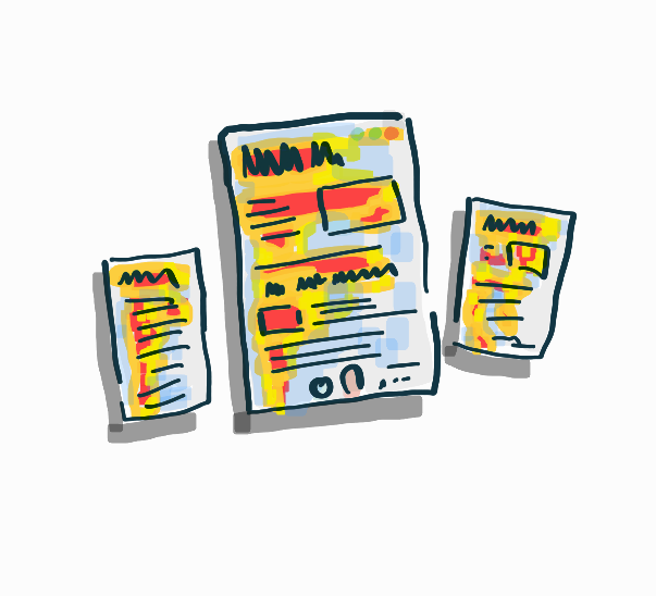
Heat maps use color intensity to show where users focus their attention. Understanding how to interpret these colors is crucial for improving your website’s engagement.
Interpreting Color Intensity
Most heat map tools use a spectrum from blue (cold) to red (hot):
- Blue/Green: Low engagement areas
- Yellow: Moderate engagement
- Orange/Red: High engagement or “hot” zones
To identify hot and cold zones:
- Look for clusters of warm colors (red, orange) indicating high engagement.
- Note areas with cool colors (blue, green) showing low engagement.
- Pay attention to the gradient between hot and cold areas.
Recognizing High and Low Engagement Areas
High engagement areas often include:
- Headlines and subheadings
- Call-to-action buttons
- Key images or infographics
- First paragraphs of content
Low engagement areas might be:
- Sidebars or widgets
- Footer content
- Areas below the fold
Use these insights to:
- Emphasize important content in hot zones
- Redesign or remove elements in persistently cold areas
- Test moving key information to hot zones for better visibility
OptinMonster says: “Articles with images get 94% more views as opposed to those with no visuals.”. This statistic underscores the importance of strategic image placement in your content.
Compare Desktop vs. Mobile Patterns
User behavior often differs significantly between desktop and mobile devices. Analyzing these differences helps create a responsive design that caters to all users.
To segment data by device type:
- Access your heat map tool’s filtering options.
- Select “Device Type” as your segmentation criterion.
- Generate separate heat maps for desktop and mobile users.
- Compare the resulting visualizations side by side.
When analyzing the differences:
- Note variations in scroll depth between devices.
- Identify elements that receive more attention on one device type.
- Check if important calls-to-action are visible and engaging on both formats.
Use these insights to:
- Adjust content layout for better mobile engagement
- Optimize button placement for touch interfaces
- Ensure critical information is visible without scrolling on mobile devices
OptinMonster also says: “71% of bloggers report using visuals as part of their marketing strategy.”. This high percentage emphasizes the importance of visual elements in content strategy across all devices.
By thoroughly analyzing attention distribution patterns, you’ll gain valuable insights into user behavior. These insights will guide your content strategy and design decisions, ultimately leading to better user engagement and conversion rates.
Advanced Tips for Maximizing Heat Map Insights
TL;DR:
- Combine multiple heat map types for deeper insights
- Use A/B testing with heat maps to refine designs
- Track heat map data over time to spot trends
Combine Heat Map Types for Comprehensive Analysis
Heat maps are powerful tools on their own, but their real strength shines when combined. By using multiple types of heat maps together, you can gain a more complete picture of user behavior and engagement on your website.
Click maps show where users interact with your page, while scroll maps reveal how far down they typically go. Overlay these with attention maps, and you’ll see a full story of user engagement. This combination can reveal patterns that might be missed when looking at each map type in isolation.
For example, you might notice high click rates on a button near the bottom of your page, but your scroll map shows that only 30% of users reach that area. This insight could lead you to move that important button higher up on the page to increase overall engagement.
Case Study: E-commerce Product Page Optimization
Consider an e-commerce product page. By combining different heat map types, you might discover:
- Click Map: High interaction with product images
- Scroll Map: 70% drop-off before reaching product reviews
- Attention Map: Strong focus on price and shipping information
These combined insights could lead to a redesign that places product images, price, and shipping information prominently at the top, with a clear call-to-action to view reviews. This approach addresses user behavior patterns revealed by multiple heat map types.
Use A/B Testing with Heat Maps
A/B testing and heat maps form a powerful duo for optimizing website design and content. By running A/B tests and analyzing the results with heat maps, you can make data-driven decisions about which design elements are most effective at engaging your audience.
Here’s how to set up an A/B test using heat maps:
- Create two versions of your webpage (A and B) with a single variable changed.
- Split your traffic evenly between these versions.
- Run heat maps on both versions for a set period.
- Compare the heat maps to see which version performs better.
When interpreting the results, look for differences in user behavior between the two versions.
Pay attention to:
- Click patterns: Are users interacting more with certain elements in one version?
- Scroll depth: Is one version encouraging users to scroll further?
- Attention distribution: Where are users focusing their attention in each version?
71% of online marketers describe content creation as their most effective SEO tactic. By combining A/B testing with heat maps, you can refine your content strategy based on real user behavior, potentially improving your SEO effectiveness.
Example: CTA Button Optimization
Let’s say you’re testing two versions of a call-to-action (CTA) button:
- Version A: Blue button with “Sign Up Now” text
- Version B: Green button with “Start Free Trial” text
After running heat maps on both versions, you might find that Version B not only receives more clicks but also shows higher scroll depth and attention focus around the button area. This suggests that the green color and “Start Free Trial” text are more effective at engaging users and encouraging action.
Analyze Heat Maps Over Time
Tracking heat map data over time can reveal valuable insights about changing user behavior, seasonal trends, and the impact of site updates. This longitudinal analysis allows you to make informed decisions about long-term website optimization strategies.
To effectively analyze heat maps over time:
- Set a regular schedule for heat map analysis (e.g., monthly or quarterly).
- Keep consistent tracking parameters to ensure comparable data.
- Document major site changes or external factors that might influence user behavior.
- Look for patterns and changes in user engagement over time.
When examining your heat maps, pay attention to:
- Seasonal variations: Do user behaviors change during holidays or specific times of the year?
- Impact of site updates: How do design changes or new features affect user engagement?
- Long-term trends: Are certain areas of your site gaining or losing attention over time?
On average, it takes about 4 hours to write a blog post. By analyzing heat maps over time, you can optimize your content strategy to ensure that the time invested in content creation yields maximum engagement.
Case Study: Blog Content Strategy Refinement
Imagine you’re running a tech blog (like this one 👀) and analyzing heat maps over a six-month period.
You might notice:
- Increasing engagement with how-to guides and tutorials
- Decreasing attention to industry news articles
- Consistent high engagement with infographics and data visualizations
These insights could inform your content strategy, leading you to:
- Produce more in-depth tutorials and guides
- Reduce frequency of news updates or present them differently
- Invest in creating more visual content like infographics
Penfriend’s Blog Success with SEO Optimization
Overview: We used Penfriend to generate SEO-optimized blog posts that significantly improved our search engine rankings and organic traffic.
Challenges: Achieving consistent rankings across multiple keywords.
Solutions Implemented: Leveraging Penfriend’s SEO tools to optimize content for search engines.
Results: A dramatic increase in keyword rankings and organic traffic.
Try Penfriend to elevate your SEO strategy with high-ranking blog content. Your first 3 articles are FREE!
By adapting your content strategy based on these long-term heat map insights, you can better align your efforts with your audience’s evolving preferences.
Segment Heat Map Data for Targeted Insights
Heat maps become even more powerful when you segment your data. By analyzing heat maps for specific user groups or behaviors, you can uncover insights that might be hidden in aggregate data.
Consider segmenting your heat map data by:
- Traffic source (e.g., organic search, social media, email campaigns)
- New vs. returning visitors
- Device type (desktop, mobile, tablet)
- Geographic location
- User demographics (if available)
Each segment may interact with your site differently, and understanding these differences can help you tailor your design and content to specific audience needs.
Example: E-commerce Site Optimization
For an e-commerce site, segmented heat map analysis might reveal:
- Mobile users struggle to reach the “Add to Cart” button on product pages
- Visitors from social media spend more time on product images
- Returning customers focus more on price comparison features
These insights could lead to targeted optimizations:
- Redesigning the mobile product page layout for easier cart access
- Enhancing image galleries for products promoted on social media
- Making price comparison tools more prominent for returning visitors
Integrate Qualitative Feedback with Heat Map Data
While heat maps provide valuable quantitative data, combining this with qualitative feedback can give you a more complete understanding of user behavior. Methods to integrate qualitative feedback include:
- User surveys: Ask visitors about their experience on specific page elements
- Session recordings: Watch individual user journeys to understand the context of heat map patterns
- User testing: Observe users interacting with your site in real-time
By combining these qualitative insights with your heat map data, you can not only see what users are doing but also understand why they’re doing it.
Practical Application: Form Optimization
Let’s say your heat map shows low engagement with a signup form, but it’s unclear why. By integrating qualitative feedback:
- Heat map data: Shows users rarely interact with the form
- User survey: Reveals concerns about data privacy
- Session recordings: Indicate users start the form but abandon it halfway
This combined insight might lead you to:
- Add clear privacy assurances near the form
- Simplify the form by removing unnecessary fields
- Implement a progress indicator to encourage completion
By leveraging these advanced tips, you can extract deeper insights from your heat map data, leading to more effective website optimization strategies. Remember, the key is to combine different types of data and analysis methods to get a comprehensive view of user behavior and preferences.
Common Pitfalls in Heat Map Analysis and How to Avoid Them
- Learn to accurately interpret heat map data
- Discover the impact of sample size and page load times
- Master techniques to avoid common analysis mistakes
Misinterpreting Color Intensity
Heat maps use colors to represent user behavior, but interpreting these colors isn’t always straightforward. Misreading color intensity can lead to incorrect conclusions and misguided decisions.
The Color Spectrum: Beyond Red and Blue
Heat map colors typically range from blue (cold) to red (hot), with variations in between. However, the meaning of these colors can vary depending on the tool and settings used. Some heat map tools use green for moderate activity, while others might use yellow.
To properly read heat map colors:
- Understand your tool’s color scheme
- Check the color legend or scale
- Consider relative intensity, not just absolute colors
Context is Key
Color interpretation isn’t just about the colors themselves, but also their context within the page and in relation to other elements.
For example, a “hot” area on a product page might indicate high interest, but if it’s on an error message, it could signal user frustration. Similarly, a “cold” area at the bottom of a long page might be normal, while the same color at the top could indicate a problem.
To avoid misinterpretation:
- Consider the page layout and content
- Compare similar elements across different pages
- Look for patterns rather than isolated hot spots
“When we use quotes from thought leaders and experts to support our argument, we show our audience that our ideas are either being shared or perhaps debated.”
Kathy Sparrow
This quote emphasizes the importance of using expert insights to support our analysis, which is crucial when interpreting complex heat map data.
Overlooking Sample Size
Sample size is a critical factor in heat map analysis that’s often overlooked. A small sample can lead to misleading results and hasty conclusions.
Determining Adequate Sample Size
The “right” sample size depends on various factors, including your website’s traffic, the specific page being analyzed, and the level of confidence you need in your results.
As a general rule:
- For low-traffic sites (< 2,000 monthly visitors), aim for at least 200-300 user sessions
- For medium-traffic sites (2,000-250,000 monthly visitors), 1,000-2,000 sessions is a good target
- For high-traffic sites (> 250,000 monthly visitors), 2,000-3,000 sessions can provide reliable insights
These are just guidelines. The key is to ensure your sample is representative of your typical user base.
Strategies for Collecting Sufficient Data
- Run heat maps for longer periods: Instead of a day or two, consider running them for a week or more.
- Target specific user segments: Focus on key user groups to get meaningful data even with smaller samples.
- Use statistical significance calculators: These tools can help determine if your sample size is large enough for reliable conclusions.
- Consider seasonality and events: Ensure your data collection period isn’t skewed by unusual circumstances.
“Even small blogs can pass useful link juice by linking to the post or book they’re quoting, and while huge bloggers may not always notice or acknowledge that they’ve been quoted, the “little guys” of the blogosphere may respond incredibly enthusiastically.”
Ali Luke
While this quote is about blog linking, it illustrates the importance of considering all data points, even from smaller sources, which is crucial in heat map analysis.
Ignoring Page Load Time Impact
Page load time can significantly affect heat map data, yet it’s often overlooked in analysis. Slow-loading pages can skew results and lead to misinterpretations.
How Page Speed Affects Heat Map Data
- Early clicks: Users might click multiple times if a page loads slowly, creating false “hot” spots.
- Scroll depth: Slow-loading elements can affect how far users scroll, impacting scroll maps.
- Time on page: Long load times can be mistaken for engagement in some heat map tools.
- Bounces: High bounce rates due to slow loading might not be captured accurately in heat maps.
Steps to Account for Load Time in Analysis
- Monitor page speed: Use tools like Google PageSpeed Insights to track load times.
- Segment data by load time: Compare heat maps for fast vs. slow-loading sessions.
- Check for correlation: Look for relationships between load times and user behavior patterns.
- Adjust tracking delay: Set your heat map tool to start tracking after the page has fully loaded.
- Optimize page speed: Address loading issues to get more accurate heat map data.
“By clearly attributing external information to sources through quotes, links, or in-text citations, content writers can showcase a just, detailed, and credible approach that their readers will appreciate.”
SALT.agency
This quote underscores the importance of a thorough, well-attributed approach to analysis, which is crucial when dealing with complex data like heat maps and page load times.
Neglecting Mobile-Specific Patterns
With mobile traffic often surpassing desktop, failing to analyze mobile heat maps separately can lead to missed opportunities and flawed conclusions.
Key Differences in Mobile User Behavior
- Thumb zones: Areas easily reached by thumbs are more likely to be interacted with on mobile.
- Vertical scrolling: Mobile users tend to scroll more than desktop users.
- Limited screen space: Elements compete more intensely for attention on smaller screens.
- Touch vs. click: Mobile interactions (taps, swipes) differ from desktop mouse movements.
Strategies for Effective Mobile Heat Map Analysis
- Use device-specific heat maps: Analyze mobile and desktop data separately.
- Consider orientation: Look at both portrait and landscape heat maps for mobile.
- Focus on mobile-specific metrics: Pay attention to tap accuracy, scroll depth, and pinch-to-zoom actions.
- Compare against mobile design best practices: Evaluate your heat maps in the context of mobile UX guidelines.
- Test on various devices: Different screen sizes can yield different heat map results.
Failing to Consider User Intent
Heat maps show where users click or look, but they don’t explain why. Neglecting user intent can lead to misguided optimizations.
The Limits of Heat Map Data
Heat maps provide valuable quantitative data but lack qualitative insights. A heavily clicked area might indicate interest, confusion, or frustration – heat maps alone can’t distinguish between these.
Integrating User Intent into Heat Map Analysis
- Combine with other data sources: Use surveys, user testing, and analytics to understand the “why” behind heat map patterns.
- Analyze user paths: Look at the sequence of interactions to infer intent.
- Consider page goals: Evaluate heat map data in the context of what you want users to do on the page.
- Segment by user type: Analyze heat maps for different user groups (e.g., new vs. returning visitors) to uncover intent-based patterns.
- Use session recordings: Watch actual user sessions to understand the context of heat map hotspots.
By avoiding these common pitfalls, you can extract more accurate and actionable insights from your heat map data. Remember, heat maps are powerful tools, but they’re most effective when used as part of a comprehensive analytics strategy.
Troubleshooting Common Heat Map Issues
- Learn how to track dynamic content accurately
- Understand privacy regulations and implement consent mechanisms
- Identify and fix common data collection inaccuracies
Dealing with Dynamic Content
Dynamic content presents unique challenges for heat map tracking. Pages with changing elements can lead to misaligned or inaccurate heat map data. To address this issue, follow these steps:
- Use static element IDs: Assign unique, static IDs to dynamic elements on your page. This helps heat map tools track these elements consistently, even when their content changes.
- Implement event-based tracking: Set up your heat map tool to track interactions based on events rather than just page loads. This method captures user behavior more accurately on dynamic pages.
- Segment data by page versions: If your page has multiple versions or states, segment your heat map data accordingly. This allows you to analyze user behavior for each specific version of the page.
- Use scroll maps: For pages with infinite scroll or dynamically loaded content, focus on scroll depth maps. These maps show how far users scroll, regardless of content changes.
- Regular data validation: Check your heat map data frequently against other analytics tools to ensure accuracy. Look for discrepancies that might indicate tracking issues with dynamic content.
Case Study: E-commerce Product Listings
An e-commerce site struggled with heat map accuracy on their product listing page, which used infinite scroll. They implemented event-based tracking and scroll depth analysis. This approach revealed that users engaged most with the first 20 products, leading to a redesign that prioritized top sellers in this prime real estate.
Addressing Privacy Concerns
Privacy regulations like GDPR have significant implications for heat map usage. Here’s how to ensure compliance:
- Understand applicable regulations: Familiarize yourself with GDPR, CCPA, and other relevant privacy laws in your region.
- Implement clear consent mechanisms: Add a cookie banner or consent form that explicitly mentions heat map tracking. Ensure it’s easy for users to opt out.
- Anonymize data: Configure your heat map tool to collect data anonymously. Avoid capturing personally identifiable information (PII) like names or email addresses.
- Use data encryption: Ensure that all collected data is encrypted both in transit and at rest.
- Limit data retention: Set up automatic data deletion after a specified period, typically no longer than necessary for analysis.
- Update privacy policy: Clearly state your use of heat maps and how you handle the collected data in your privacy policy.
- Vendor assessment: If using a third-party heat map tool, ensure they are GDPR compliant and have proper data processing agreements in place.
Implementing Consent Mechanisms
To implement an effective consent mechanism:
- Create a clear, concise cookie banner
- Include specific mention of heat map tracking
- Provide easy opt-out options
- Use a consent management platform (CMP) for more complex needs
OptinMonster reports that “60% of marketers have a documented personalization strategy.” This highlights the importance of balancing personalization with privacy concerns in your heat map strategy.
Fixing Inaccurate Data Collection
Inaccurate data can lead to misguided decisions. Here are common reasons for data inaccuracies and how to fix them:
- Incorrect tracking code installation:
- Double-check code placement (ideally just before the closing </body> tag)
- Verify code is on all pages you want to track
- Use browser developer tools to confirm the tracking script is loading
- Browser compatibility issues:
- Test your heat map tool across different browsers and versions
- Update your tool if it’s not compatible with modern browsers
- Sampling errors:
- Increase your sample size for more accurate results
- Ensure you’re collecting data over a sufficient time period
- Caching problems:
- Implement cache-busting techniques to ensure fresh data collection
- Use version numbers or timestamps in your tracking code
- Bot traffic:
- Enable bot filtering in your heat map tool settings
- Cross-reference with your main analytics tool to identify discrepancies
- Mobile responsiveness issues:
- Test heat maps on various device types and screen sizes
- Use device-specific heat maps for more accurate analysis
- Page load time impact:
- Optimize your page load speed
- Set a delay in your heat map tool to start tracking after full page load
OptinMonster notes that “Around 5% of bloggers don’t have access to analytics.” While this statistic isn’t specific to heat maps, it underscores the importance of having proper analytics in place, including accurate heat map data.
Troubleshooting Steps
For each issue identified:
- Isolate the problem: Determine which pages or elements are affected
- Check tool settings: Ensure your heat map tool is configured correctly
- Compare with other data: Cross-reference with other analytics tools
- Test in controlled environment: Use a staging site to troubleshoot
- Contact support: If issues persist, reach out to your heat map tool’s support team
By addressing these common issues, you’ll ensure your heat map data is accurate and reliable, leading to more informed decision-making in your content strategy and user experience design.
Expanding Your Heat Map Knowledge
- Discover innovative heat map applications beyond web analytics
- Explore future trends in user behavior tracking technology
- Learn how to integrate heat maps with other analytics tools
Alternative Heat Map Applications
Heat maps have found applications far beyond website analytics. In UX design, heat maps help designers understand user interactions with interfaces. Marketing teams use heat maps to analyze ad performance and email engagement.
One innovative application is in retail store layout optimization. Retailers use heat maps to track customer movement patterns within physical stores. This data helps optimize product placement and store layout for increased sales.
A study by PathIntelligence found that optimizing store layouts based on heat map data increased sales by up to 8% in some cases.
In scientific research, heat maps visualize complex data sets. For example, biologists use heat maps to represent gene expression levels across different conditions. This allows for quick identification of patterns and anomalies in large datasets.
Case Study: Urban Planning with Heat Maps
Urban planners use heat maps to analyze pedestrian traffic patterns. This data informs decisions about public space design, street furniture placement, and traffic flow optimization. For instance, the city of Melbourne, Australia uses heat maps from pedestrian sensors to inform urban development decisions.
Future Trends in Heat Map Technology
The future of heat map technology is closely tied to advancements in user behavior tracking. Several emerging trends are set to reshape how we collect and analyze user interaction data.
AI-Powered Predictive Heat Maps
Machine learning algorithms are being developed to predict user behavior based on historical heat map data. These predictive heat maps could allow businesses to anticipate user needs and optimize content preemptively. Google’s HEART framework for UX metrics provides a foundation for such predictive models.
Real-Time Heat Map Generation
Current heat maps often rely on aggregated data over time. Future technologies aim to generate heat maps in real-time, allowing for immediate insights and dynamic content optimization. This could revolutionize areas like live event management and emergency response planning.
3D Heat Maps for Virtual and Augmented Reality
As VR and AR technologies become more prevalent, 3D heat maps will be crucial for understanding user interactions in these immersive environments. These heat maps will help designers create more intuitive and engaging virtual experiences.

Integrating Heat Maps with Other Analytics Tools
Combining heat map data with other analytics tools provides a more comprehensive view of user behavior. This integration allows for deeper insights and more informed decision-making.
Heat Maps and Google Analytics
Integrating heat maps with Google Analytics can reveal the ‘why’ behind your website’s performance metrics.
Here’s a step-by-step guide to combining these tools:
- Set up event tracking in your heat map tool to send data to Google Analytics.
- Create custom segments in Google Analytics based on heat map interactions.
- Analyze these segments against other metrics like conversion rates and bounce rates.
This integration allows you to answer questions like: “Do users who interact with specific page elements have higher conversion rates?”
Combining Heat Maps with A/B Testing Tools
When integrated with A/B testing tools, heat maps can provide visual context to test results.
This combination allows you to:
- Identify areas for improvement using heat maps.
- Create A/B test variations based on heat map insights.
- Use heat maps to visually compare user behavior between test variations.
Tools like Optimizely and VWO offer integrations with popular heat map solutions, streamlining this process.
Heat Maps and User Session Recordings
Combining heat maps with user session recordings provides a powerful way to understand individual user journeys. While heat maps show aggregate data, session recordings allow you to see how specific users interact with your site.
This combination helps in:
- Identifying pain points in the user journey
- Understanding why certain areas of your site are ‘hot’ or ‘cold’
- Validating heat map findings with real user behavior
Tools like Hotjar offer both heat maps and session recordings, making this integration seamless.
By integrating heat maps with other analytics tools, you create a holistic view of user behavior. This comprehensive approach leads to more accurate insights and data-driven decisions, ultimately improving user experience and achieving business goals.
Additional Content Marketing Resources:
For additional marketing resources, visit our blog to get access to our Content Marketing Playbooks:
- The 2024 Guide to Creating a Content Marketing Strategy: What’s New and What Works
- How to edit AI content to make it YOURS
- Content Refresh’s: Your 2024 Step by Step Guide
- Subscription Business Case Studies: 25 Examples with Growth Tactics
- Content Scaling: 10 Steps to Up Quantity Without Sacrificing Quality
- Create SEO-Optimized Blog Posts for Higher Rankings with Penfriend
Heat Map FAQs:
How do heat maps reveal user behavior and engagement on a website?
Heat maps offer a visual representation of user behavior and engagement on websites. They use color coding to illustrate user interactions, like clicks and scrolling, highlighting areas of interest and neglect.
Here’s how heat maps achieve this:
Click Tracking: Heat maps visually represent where users click on a webpage, revealing popular elements and areas of interest.
Scroll Depth Visualization: Heat maps demonstrate how far users scroll down a page, indicating the visibility and engagement levels of content placed below the initial viewport.
Attention Distribution: By analyzing heat map color intensity, one can identify “hot zones” where users focus the most attention and “cold zones” that receive little interaction.
By using these features, heat maps provide insights into user behavior, enabling website owners to:
Identify Engaging Elements: Discover which elements attract the most clicks and attention, such as headlines, calls to action, or images.
Optimize Content Placement: Understand how far users scroll and reposition essential content to areas of higher visibility.
Improve Website Design: Identify and redesign areas with low engagement, ensuring key information is readily accessible.
Compare Device-Specific Behavior: Analyze heat maps segmented by device type (desktop, mobile) to understand user behavior differences and optimize design accordingly.
While heat maps are valuable tools, they should be used in conjunction with other analytics methods for a comprehensive understanding of user experience.
How can heat maps be used to improve user experience and content strategy?
Using Heat Maps to Enhance User Experience and Content Strategy
Heat maps can significantly improve user experience (UX) and content strategy by providing visual insights into user behavior on your website. This data allows for informed decisions regarding website design and content placement for increased engagement and conversion rates.
Improving User Experience with Heat Maps
Identify High-Engagement Areas: Heat maps reveal “hot zones” where users focus their attention, such as captivating headlines, compelling calls-to-action, or engaging visuals like infographics. By understanding these high-engagement areas, you can prioritize placing crucial content and interactive elements where they are most likely to be seen and engaged with.
Optimize Content Placement for Maximum Visibility: Scroll depth heat maps visually represent how far users scroll down a page. By analyzing these maps, you can strategically position essential content, such as key information, calls-to-action, or product descriptions, within the visible area where users are more likely to engage with them. This ensures important information isn’t hidden “below the fold,” leading to better user experience and higher conversion rates.
Redesign Low-Engagement Areas: Heat maps highlight “cold zones” or areas with low user interaction. This data prompts a reevaluation of these areas. You can choose to redesign them, remove unnecessary elements, or relocate important information from cold zones to high-engagement areas for better visibility and user experience. For example, if a sidebar consistently receives low engagement, consider removing it or moving crucial information to a more prominent position.
Create a Seamless Mobile Experience: User behavior often differs between desktop and mobile devices. By segmenting heat map data by device type, you can uncover these differences and optimize the website design accordingly. For example, mobile users might struggle to reach a “Add to Cart” button placed in a less thumb-friendly zone. Heat maps can reveal such issues, leading to a redesign that prioritizes mobile usability.
Refining Content Strategy with Heat Maps
Tailor Content Based on Engagement Patterns: Heat maps reveal the type of content that resonates most with your audience. For example, if you notice higher engagement with how-to guides compared to industry news articles on your tech blog, it might be beneficial to create more in-depth tutorials and guides and reduce the frequency of news updates or explore different ways to present them.
Optimize Image Placement: Visuals are crucial for engagement. Articles with images receive significantly more views. By analyzing scroll depth heat maps, you can strategically position images where they are most likely to be seen, maximizing their impact and improving user engagement.
Test and Refine Content Strategies: Heat maps can validate the effectiveness of your content strategies. For instance, if you implement a new content format or change the structure of your articles, heat maps can track changes in user engagement, revealing whether the changes positively impact user behavior or require further adjustments.
Understand User Journey and Optimize for Conversions: By analyzing heat map data in conjunction with other analytics tools like Google Analytics or session recording tools, you gain a deeper understanding of the user journey on your website. This information allows you to optimize the user flow for conversions. For example, you can identify where users drop off in the conversion funnel and use heat maps to understand the reasons behind the drop-off, leading to targeted improvements.
Heat maps are most effective when combined with other analytics tools and qualitative feedback mechanisms, providing a comprehensive view of user behavior and preferences. This holistic approach enables informed decisions, leading to a more engaging and user-friendly website experience.
What are the limitations of heat maps and how can they be used effectively?
While heat maps are valuable tools for understanding user behavior on websites, they do have limitations. The sources point out several common pitfalls in heat map analysis and offer solutions for using them effectively.
The limitations of Heat Maps:
Misinterpreting Color Intensity: The sources caution against misinterpreting the color intensity in heat maps. While colors generally range from blue (cold) to red (hot), the specific meaning can vary depending on the heat map tool and its settings. The context of the page is also crucial. For instance, a “hot” area on an error message might indicate user frustration rather than interest. It’s essential to consider the color scheme of the specific tool, the context of the page, and relative intensity rather than just absolute colors.
Overlooking Sample Size: Heat maps generated from a small sample size can be misleading. The appropriate sample size depends on factors like website traffic and the desired confidence level in the results. The sources suggest general guidelines for adequate sample sizes based on website traffic. For instance, websites with low traffic (under 2,000 monthly visitors) should aim for at least 200-300 user sessions for reliable heat map data. Strategies for gathering sufficient data include running heat maps for extended periods, targeting specific user segments, using statistical significance calculators, and considering seasonality or special events that might influence user behavior.
Ignoring Page Load Time: The sources emphasize that page load time can significantly impact heat map data. Slow-loading pages can lead to inaccurate “hot spots” due to repeated clicks from impatient users, influence scroll depth, and distort time-on-page metrics. To mitigate this, monitor page load times using tools like Google PageSpeed Insights, segment data by load time for comparison, look for correlations between load times and user behavior patterns, adjust heat map tracking to start after full page load, and optimize page speed for more accurate data.
Neglecting Mobile-Specific Patterns: With the prevalence of mobile traffic, analyzing mobile heat maps separately is crucial. Failing to do so can result in missed opportunities and flawed conclusions. The sources highlight key differences in mobile user behavior, including thumb zones (areas easily reached by thumbs), greater reliance on vertical scrolling, limited screen space intensifying competition for attention, and differences between touch interactions and desktop mouse movements. Effective mobile heat map analysis involves using device-specific heat maps, considering both portrait and landscape orientations, focusing on mobile-specific metrics like tap accuracy and scroll depth, comparing findings against mobile UX best practices, and testing on various devices to account for different screen sizes.
Failing to Consider User Intent: Heat maps alone cannot explain user intent. They reveal where users click, scroll, or focus, but not the “why” behind these actions. A highly clicked area could indicate interest, confusion, or frustration. To address this, combine heat map data with other sources like user surveys, user testing, analytics, and session recordings to gain qualitative insights into user intent. Analyze user paths, consider page goals, segment data by user type, and leverage session recordings to understand the context behind heat map patterns.
Effective Use of Heat Maps:
Combine Multiple Heat Map Types: Using different types of heat maps together, such as click maps, scroll maps, and attention maps, provides a comprehensive understanding of user behavior and reveals patterns that might be missed when analyzing them in isolation.
Use A/B Testing: Running A/B tests on design variations and analyzing the results with heat maps enables data-driven decisions about which elements are most effective in engaging users.
Track Data Over Time: Analyzing heat maps over time reveals changing user behaviors, seasonal trends, and the impact of website updates, facilitating informed decisions about long-term website optimization strategies.
Segment Heat Map Data: Segmenting data by factors like traffic source, new vs. returning visitors, device type, geographic location, and user demographics allows for targeted insights and a deeper understanding of how different user groups interact with the website.
Integrate Qualitative Feedback: Combining heat maps with qualitative data from user surveys, session recordings, and user testing provides context and helps understand the “why” behind user actions observed in heat maps.
Heat maps are most effective when used in conjunction with other analytics methods and qualitative feedback mechanisms for a holistic understanding of user behavior and preferences.
Heat Maps: Your Roadmap to Better User Engagement
Heat maps are powerful tools for understanding user behavior. They show you where readers click, scroll, and focus their attention. When you use different types of heat maps together, you can get a complete picture of how people interact with your site. This data helps you make smart design choices and improve user experience.
Ready to boost your website’s performance?
Start by driving traffic to your site, and then choose a heat map tool that fits your needs. Set it up, define your areas of interest, and begin collecting data. Remember to analyze patterns over time and across devices.
How will you use heat maps to enhance your website’s user experience?
You should write a blog about it!
Next Steps
Start using Penfriend to create topical authority that establishes your brand as a thought leader, engage your audience, drive organic traffic and generate leads. Sign up for a free trial today and see how Penfriend can enhance your content strategy.
Your first 3 articles are FREE!
If this information was helpful, please share it with your people on social
Share on Facebook | Tweet | Share on LinkedIn
